View Demo
Keeping pace with Covid
Introduction
In 2020, the world was impacted with Covid-19, an illness that spreads from person to person. According to the CDC, the overall cumulative Covid-19 associated hospitalization rate is 4.6 per 100,000, with the highest rates in people 65 years and older (13.8 per 100,000) and 50-64 years (7.4 per 100,000). To prevent the spread, CDC guidelines ask the population to limit in-person contact as much as possible, resulting in hospitals limiting visitors inside the facility.
Challenge
The pandemic created a great deal of turmoil for hospital staff and families. In the beginning, patients were not allowed to have a family member or friend close by their bedside. The new CDC regulations left patients alone in the hospital, creating a problem for family members and friends longing to know the status of their loved ones.
Solution
My solution was to create an app named Patient Access Care Emergency (PACE) to system allowing family members and friends to track patient status during hospitalization.
Design Process
Focusing on the family
Research
My first steps were to identify the user’s pain points and discover market behavior to help me bring PACE to life. Defining the market for this type of application is essential to investigate because a pandemic does not happen often. I completed a competitive analysis to understand how current medical applications catered to assist patient’s families.
User experience is never the same for anyone. That's why I used qualitative and quantitative research through interviews and an online survey to help define user goals and needs.
Competitive Analysis
In my competitive analysis research, I found EASE, an app similar to PACE, used in ten hospitals at the time. I saw that EASE had the operability that I wanted but fell short in some areas. Through EASE, families receive photos, doctor’s phone calls, and updated text messages to inform them how the patient is doing. The only downfall of EASE is all messages disappear in 60 seconds after being opened.
Adding the following elements to my app, PACE, alleviated users’ worries:
• 24-hour message display
• Medical dictionary
• Direct phone link to patient roomsCompetitive Analysis Card 1
Competitive Analysis Card 2
Competitive Analysis Card 3
Competitive Analysis Card 4
User Research
Next, I conducted qualitative and quantitative research involving participants who partook in interviews and an online survey to better understand user's needs and behavior, helping to make PACE successful. With this research I had a clearer idea of what target users wanted in this application if they had a family member in the hospital. The following are key insights I received from my three one-on-one interviews and 25 responses from my online form. To view them, click the following links.
Key takeaways from the research
Participants are keen to have immediate updates.
Participants would like a button for hospital location and room number.
Family members want to have access to medical files.
Participants are interested in accessing a medical dictionary to understand medical files and terminology.
Participants had major concerns over security and the possibility of hacking.
Participants would like messages to be translated into patients’ and user’s languages.
Observing where it matters
Affinity Map
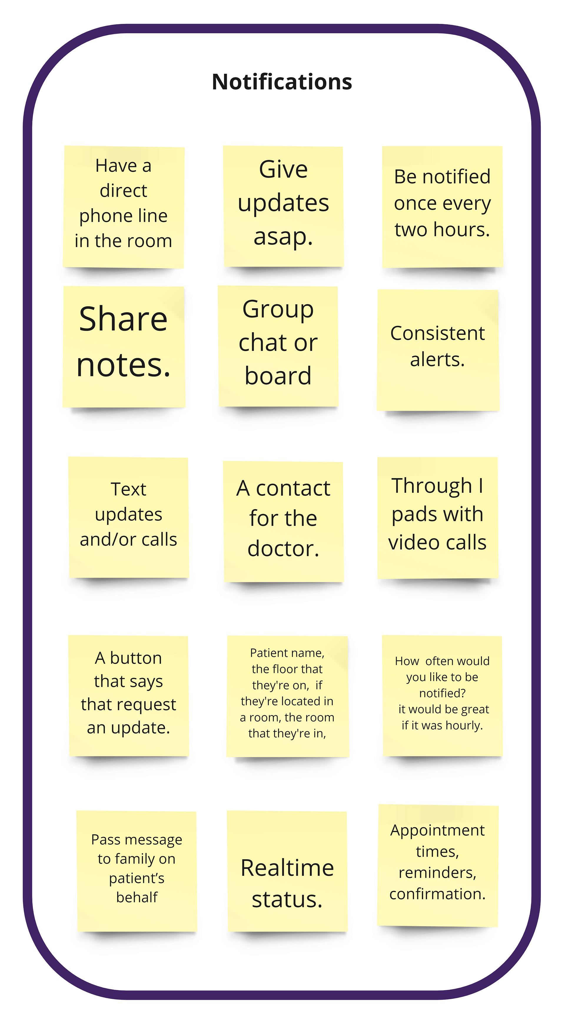
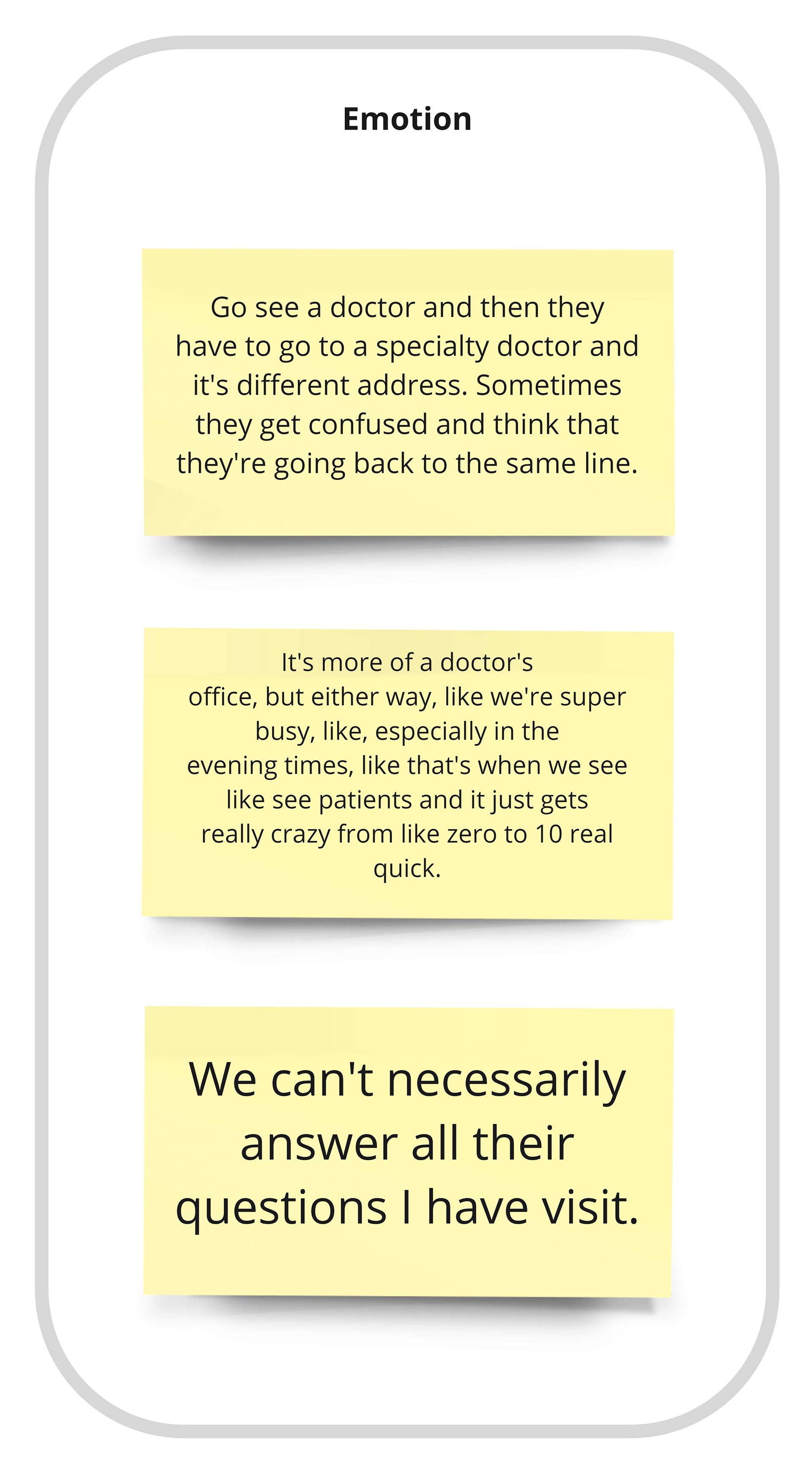
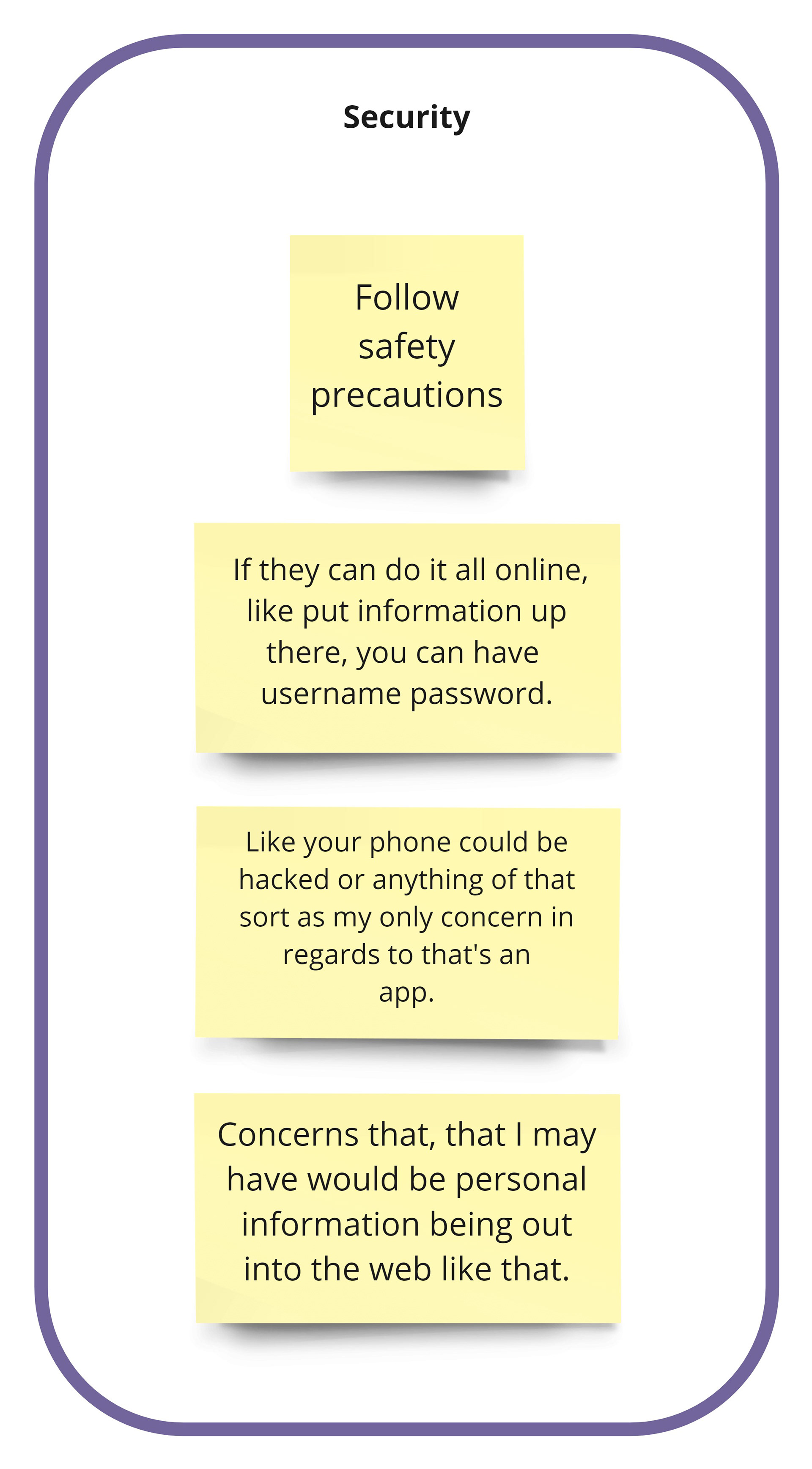
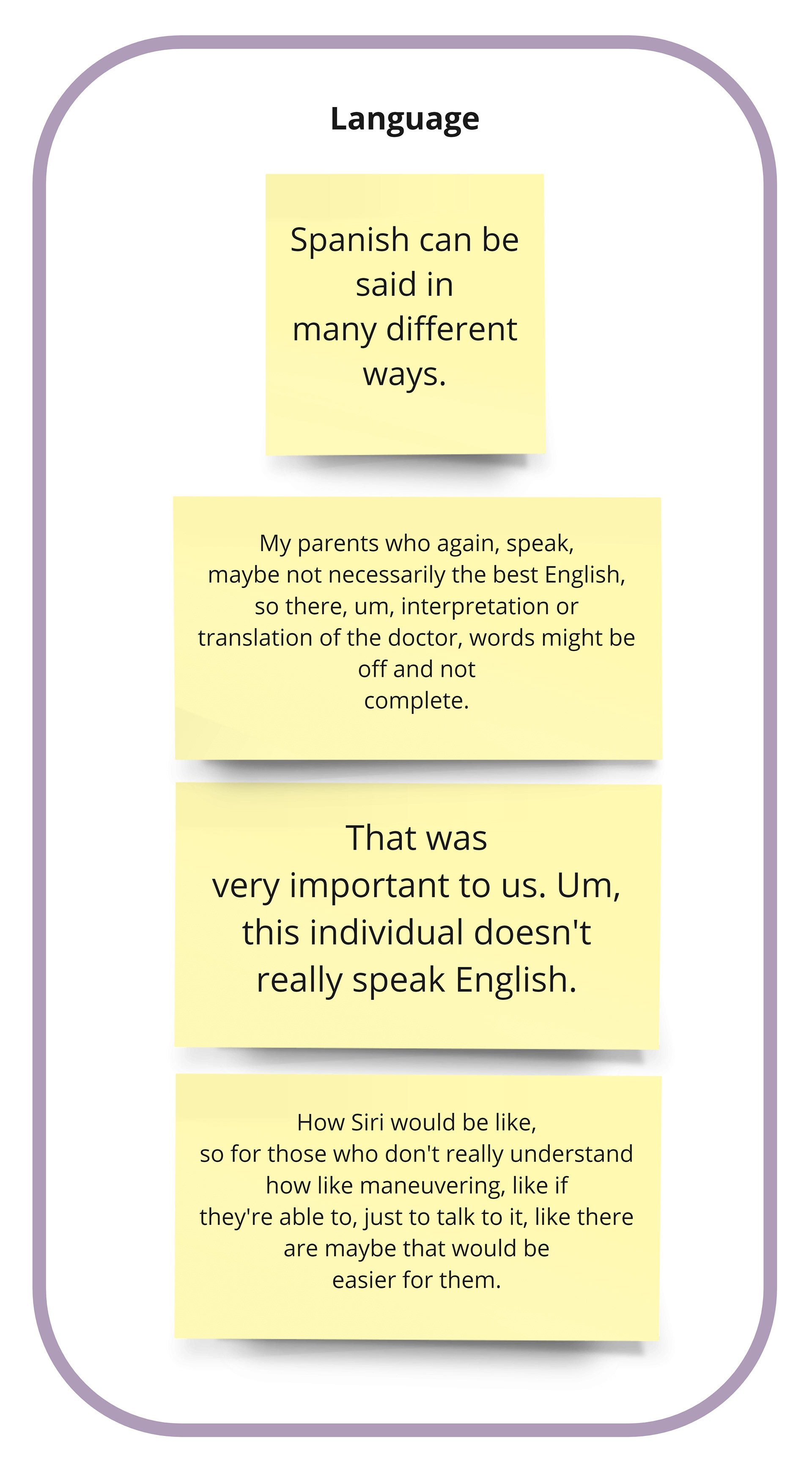
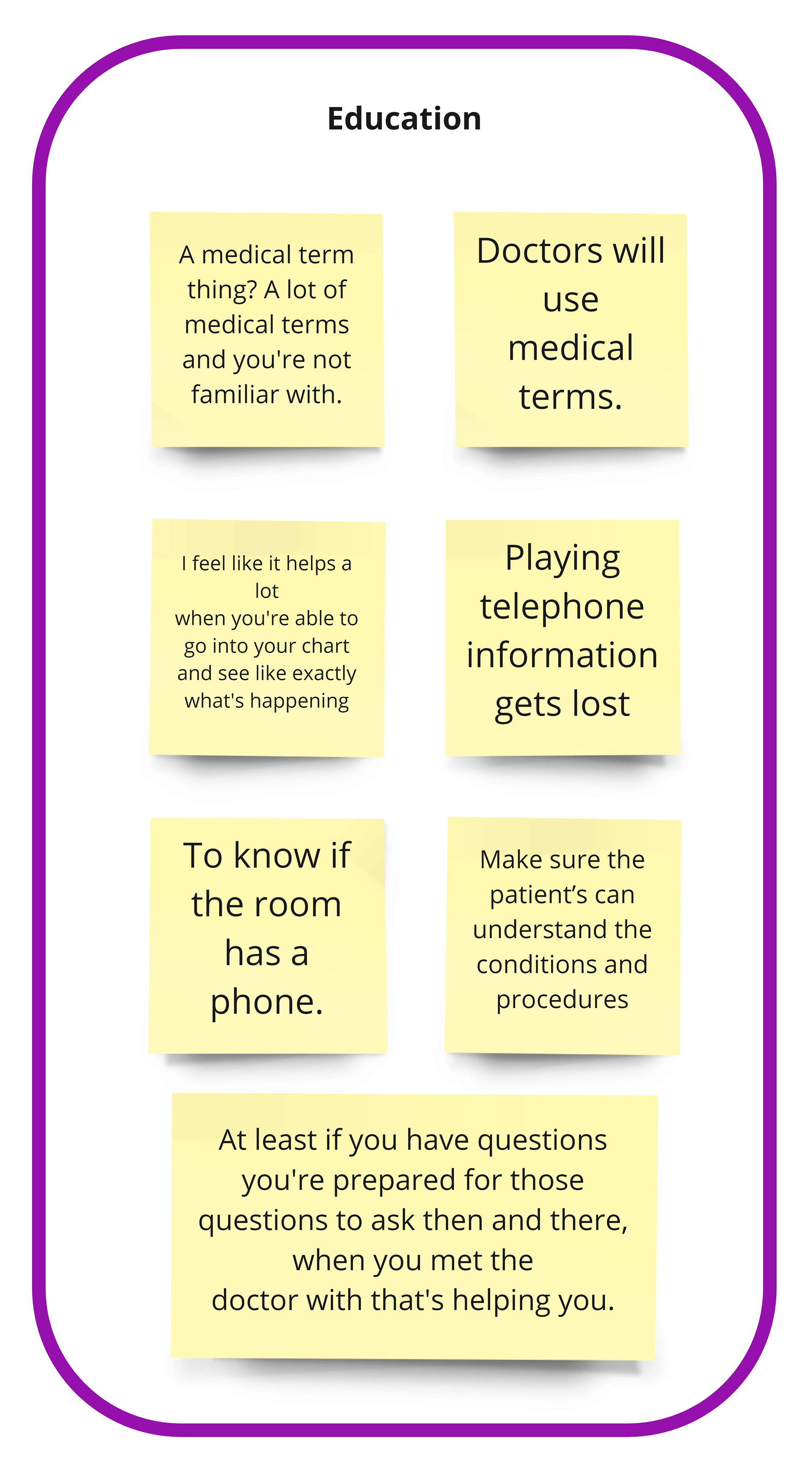
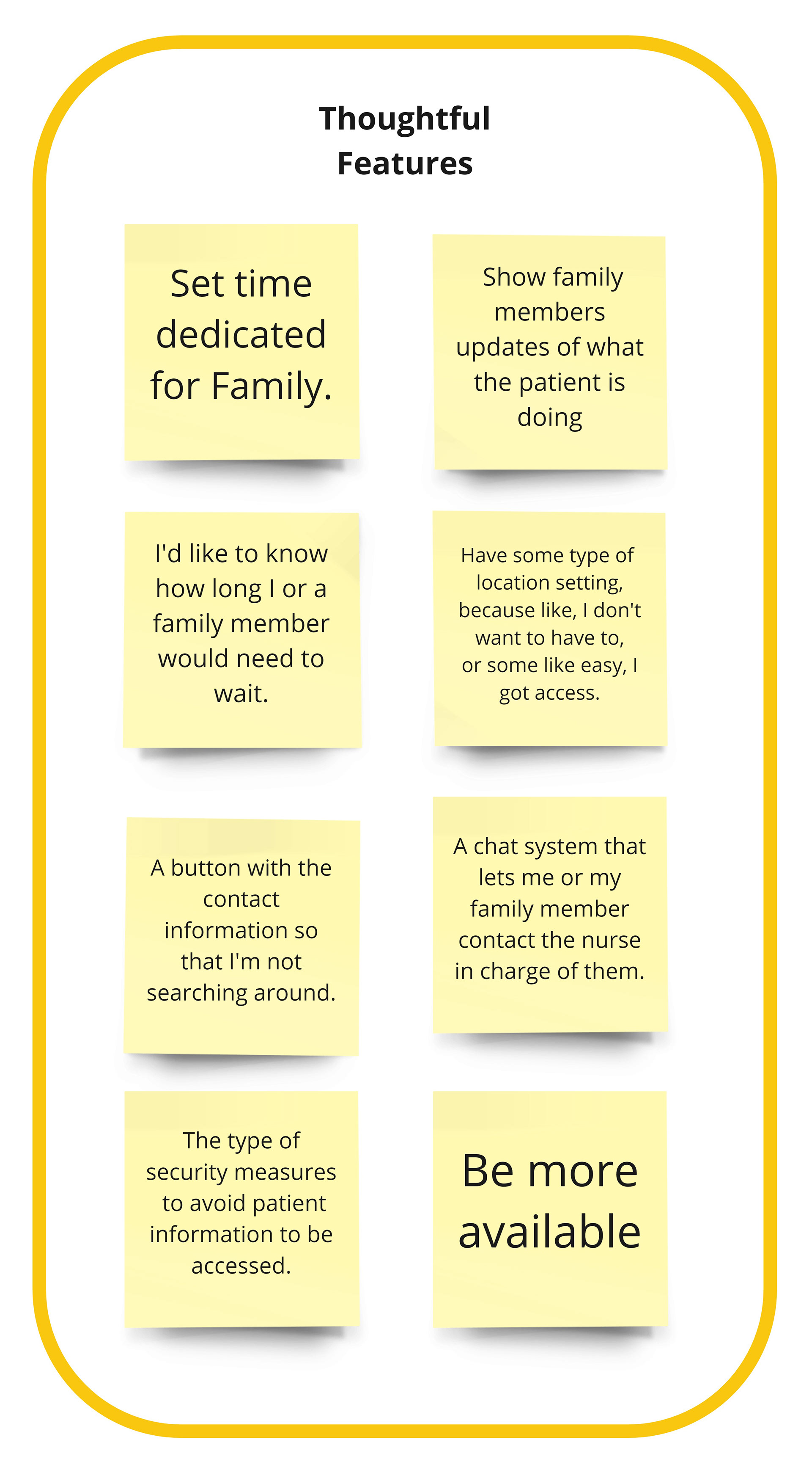
To synthesize the information from the interviews and survey, I created an affinity diagram using Miro. This method revealed pain points from the participants that were categorized into six feature clusters: Notification, Emotion, Language, Security, Education, and Thoughtfulness. This helpful observation of clusters made me rethink my top five usability goals, define the target audience better, and create personas.
Connecting the voice to the solution
Personas
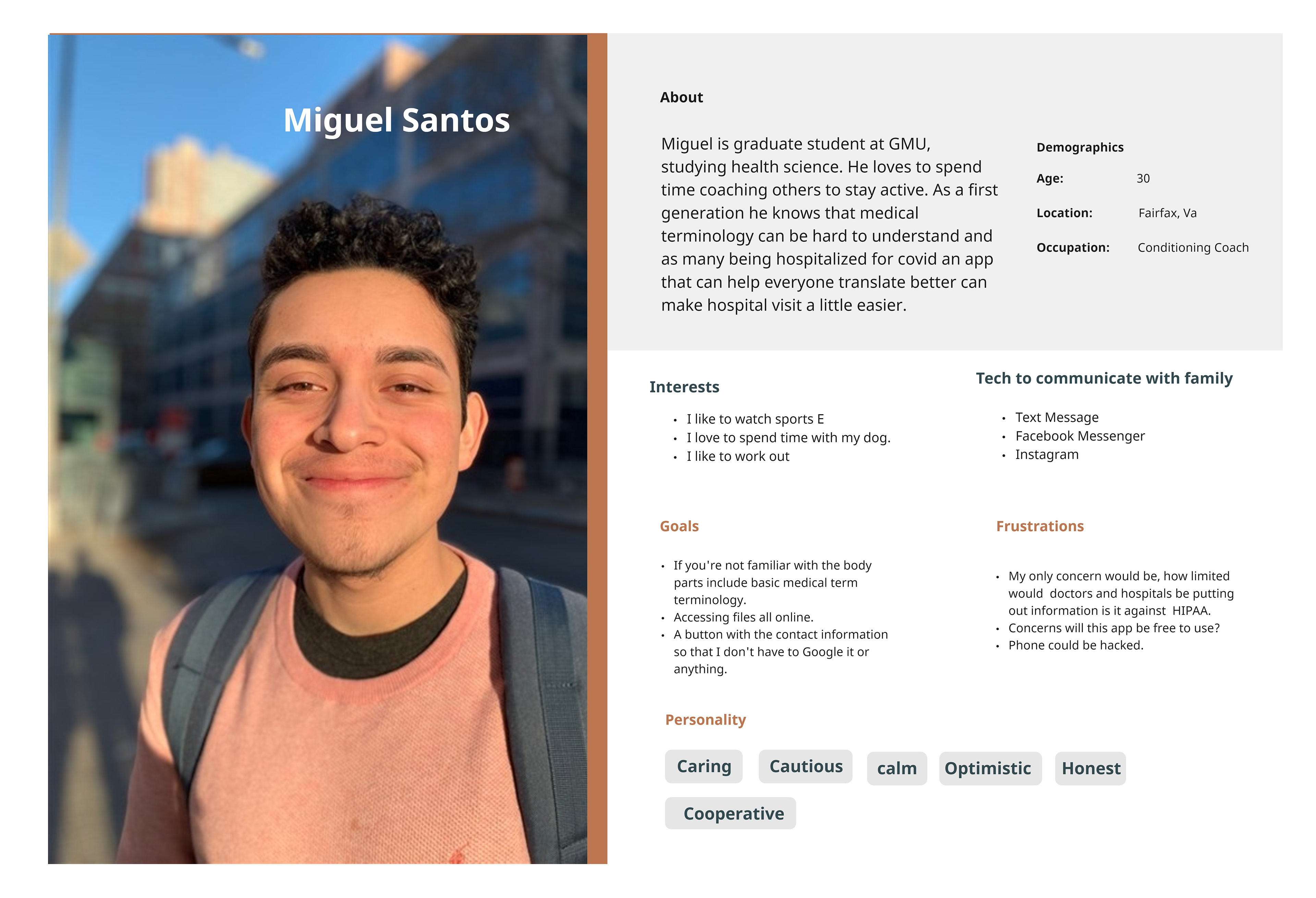
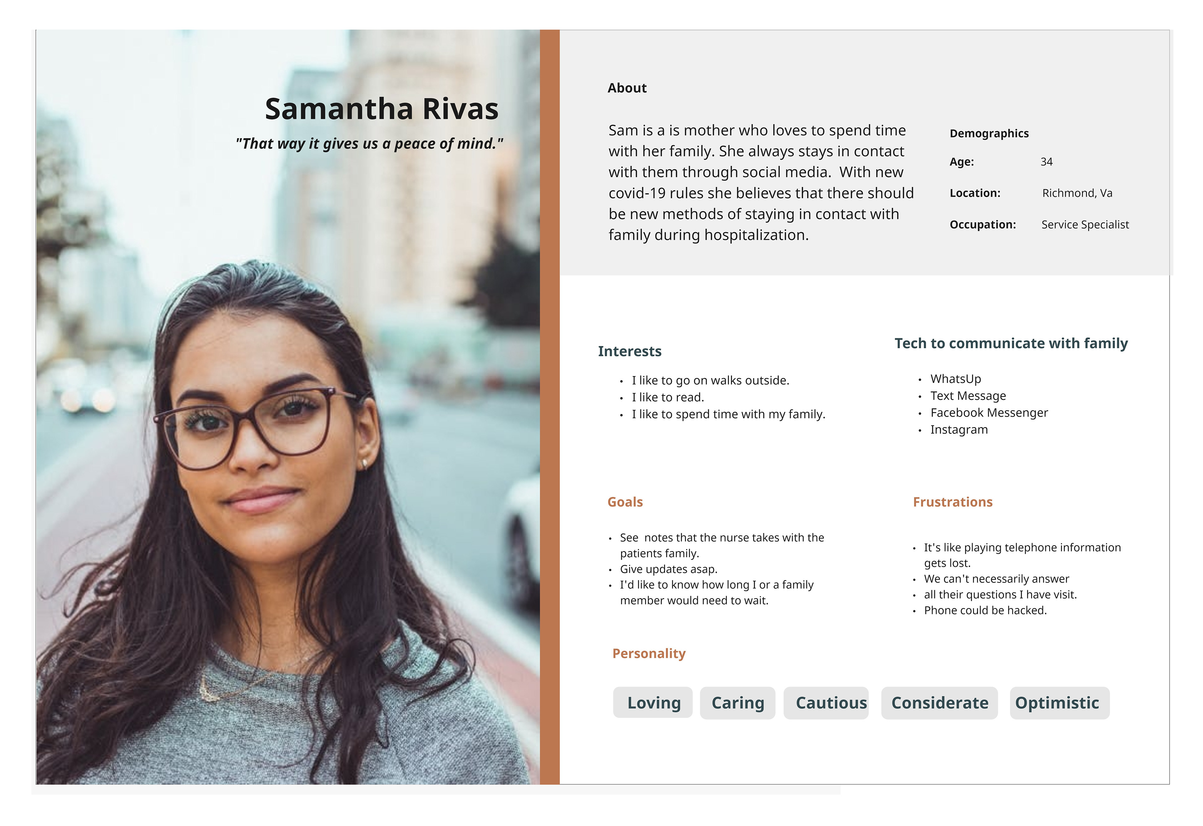
Who is the audience for PACE? To help define them, I created two personas through research results – Miguel and Samantha. Their personas helped me understand their goals and frustrations, enabling me to design a focused storyboard and develop an intuitive app. This stage felt like a turning point in the project. There was a greater connection for me by creating an application for Miguel and Sam.
Empathy Map
I developed an empathy map to get an idea of what the target audience will say, think, do, and feel. It was necessary to understand the attitudes and behaviors of the user when put in the position of having a family member in the hospital. As a designer, we design for the unheard, and this tool allowed me to bring that person to life.
Problem Statement: Learning how your loved one is doing when hospitalized has become difficult due to strict Covid-19 rules.
Storyboard
To view how the application can help resolve user’s goals, I sketched a storyboard on how Samantha wants to learn the status of her mother's hospitalization during the Covid pandemic.
Storyboard Sketches
Ideating a seamless experience
User Flow
My storyboard featured the user goal, giving me the steppingstones required to write out a task flow. In this series of steps, Samantha will achieve her goal of accessing her mother's status page. This deliverable aided the user flow construction creating a seamless experience for the user in a low fidelity wireframe.
User Flow created in Miro
Low Fidelity Wireframes
Wireframes allowed me to showcase how my app would flow. The user flow guided me on how to think about how the user is looking for a simple and approachable application to make them feel secure, able to find answers about their loved ones during hospitalization.
Sketches of Low Fidelity
Minimum Viable Product (MVP) and Sitemap
When it was time to extend the architecture of the application into a sitemap, the MVP allowed me to look at what features I should consider. I knew I did not want the user to feel overwhelmed on the home page. Focusing on the high impact and high urgency features on the patient page, I set up medical records, call room, direct messaging, and check status as a high priority for the user. Research showed that it was beneficial for the user.
Minimum Viable Product for Pace
Sitemap for Pace
Medium Fidelity Wireframes
I designed the medium fidelity wireframes in Adobe XD. I began to construct the sitemap into an interactive product with the end-user in mind. My goal was to make the functionality feel effortless because the user was already in a stressful situation. In addition, I thought it was meaningful to develop an onboarding process to build trust with the user as I discovered their pain points.
Building an approachable brand
Design
With the wireframes created, it was time to look at adding visual design to the product. The app had to show it was approachable, positive, and compassionate through the use of colors, illustrations, and typography. I chose orange and purple as the main color palette: orange because it provided positive energy, and purple to encourage spiritual growth through tough times. The typography selections are friendly and make messaging between the user and patient feel comfortable. The logo is a beacon of communication and care. Adding these elements provided an emotional connection to the user.
High-Fidelity Wire Frames & Prototype
The final task was to combine the medium fidelity wireframes with visual design. I created the high fidelity wireframes in Adobe XD. Working in this application, I gained an understanding of naming my components because I saw how the Asset section would become overwhelmed with clusters of the same style buttons. The blueprints of my medium fidelity design established a clean hierarchy within each screen. The goal was to make the user feel hopeful and calm, with PACE supporting them as they learned of their family with updates, status reports, and secure communications. I moved on to prototyping to a transition page with each button. To view the prototype click here.
Final Thoughts
For this project, I took on the task of creating an app to help families dealing with Covid-19 because I myself experienced a family member’s hospitalization during the pandemic, and knew firsthand the difficulty of communicating with them. I knew others were going through this and I wanted to find a solution.
UX research taught me not to design for one user because everyone's needs and wants are different. Interviewing led me to discover the top goals for the app. In the process, I accomplished working in a remote setting, conducted and analyzed research methods, and developed prototypes. I worked in Miro to organize all of the assets. With Covid-19 here for a while, this app is necessary to make the user feel calm and hopeful, knowing how their family member is doing.
As an opportunity to grow as a designer, I would love to explore user testing more and design additional dashboard pages to achieve the desired outcome.
